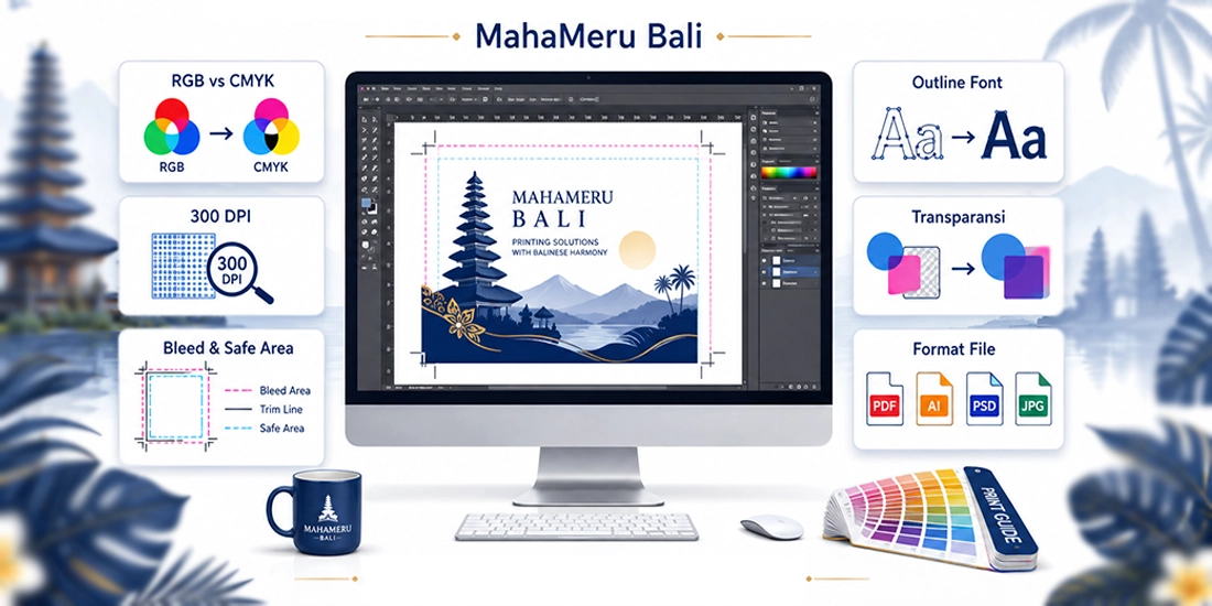
Print-Ready File Setup Guide
A high-quality print result depends not only on advanced printing machinery and premium materials, but also heavily on the preparation of your design files. Incorrect color modes, low resolution, un-outlined fonts, or missing bleed can lead to unexpected printing results.
To help you achieve sharp, clean, and accurate prints that match your design vision, MahaMeru Bali recommends reviewing your artwork files prior to submitting them for production.
This guide applies to a wide range of prints products including business cards, brochures, flyers, booklets, books, magazines, posters, stickers, calendars, packaging, banners, backdrops, signage, and various other digital and offset printing needs.
Important: File specifications may vary depending on product type, finished size, paper stock, finishing options, and production method. If you are unsure, feel free to consult with our team at MahaMeru Bali prior to printing.
Quick Pre-Flight Checklist
- Use CMYK color mode.
- Set artwork to actual print size.
- Ensure sufficient image resolution (±300 DPI).
- Add bleed around edge-to-edge designs.
- Keep text/logos inside the safe area.
- Convert fonts to Outlines / Curves.
- Flatten or inspect transparency & effects.
- Double-check Overprint settings.
- Use appropriate black values (Pure vs. Rich Black).
- Avoid borders too close to the trim line.
- Proofread text, contact info & QR codes.
- Save a master editable source file before exporting.
1. RGB vs. CMYK Color Modes
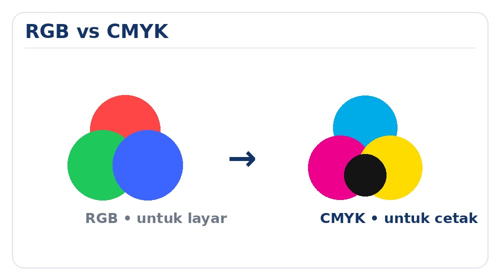
Visual comparison between RGB and CMYK color modes in printing
RGB is used for digital screens, while CMYK is the industry standard for physical printing.
One of the most common reasons printed colors differ from monitor displays is designing in the wrong color mode.
What is RGB?
RGB stands for Red, Green, and Blue. The RGB color model relies on light emission and is standard for digital displays such as:
- Computer monitors
- Smartphone and tablet screens
- Televisions
- Digital cameras
- Websites and social media
Because RGB relies on light, certain vibrant screen colors look extremely bright and vivid on digital displays.
What is CMYK?
CMYK stands for:
- C — Cyan
- M — Magenta
- Y — Yellow
- K — Black (Key)
CMYK is the color system used in physical ink and toner printing. Because RGB and CMYK have different color gamuts, highly vibrant screen colors may appear slightly darker, softer, or muted once converted to CMYK.
MahaMeru Bali Recommendation: Set your document color mode to CMYK right from the start if your artwork is intended for physical print.
Why screen colors aren’t 100% accurate print references
Color rendition varies from monitor to monitor depending on brightness, contrast, panel quality, color profiles, and hardware calibration.
Furthermore, screens generate colors using emitted light, whereas printing presses apply ink or toner pigments onto physical media. Therefore, printed output cannot be guaranteed to match smartphone or monitor screens 100% identically.
2. Image Resolution & Photo Quality
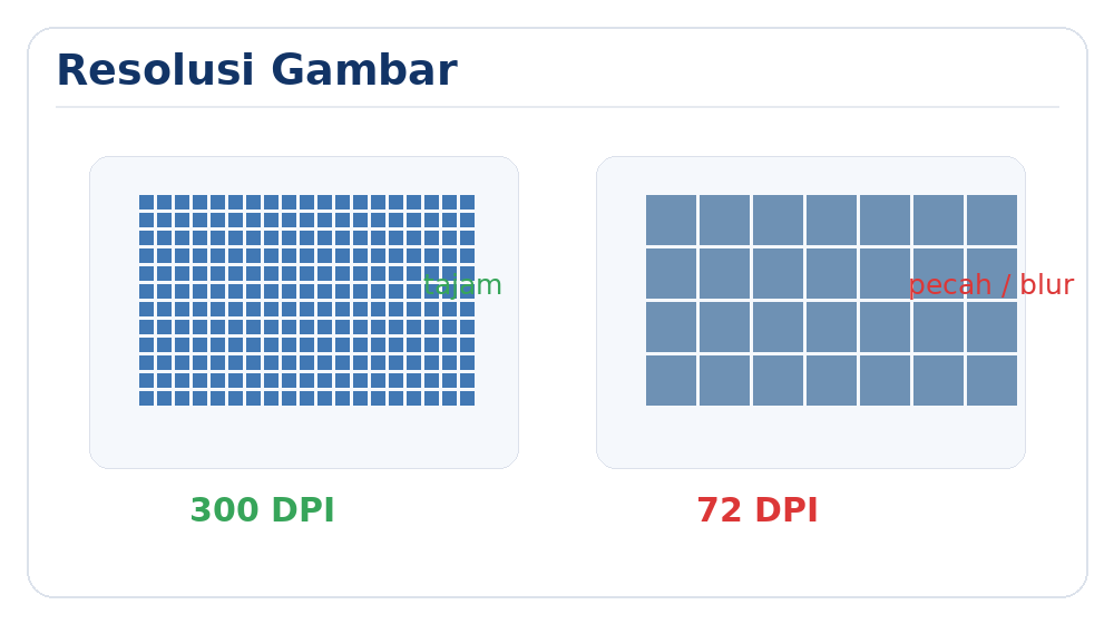
Comparison between high-resolution (300 DPI) and low-resolution images
Resolution determines the level of detail contained within an image. If the resolution is too low, the printed output will look pixelated, blurry, or fuzzy.
Resolution for Digital & Offset Printing
For close-range viewing items such as business cards, brochures, booklets, books, catalogs, calendars, small posters, and paper goods, we recommend image resolution to be:
±300 DPI at actual print size.
Keep in mind that resolution must be evaluated based on the final size of the image within your design layout.
Example
A photo may have sufficient resolution when scaled to 10 × 10 cm. However, if stretched to 30 × 30 cm, the same number of pixels is spread across a much larger surface, resulting in reduced sharpness.
In short:
- Scaling an image down increases its effective resolution.
- Scaling an image up decreases its effective resolution.
Large Format Printing
Large format items such as banners, backdrops, billboards, signage, and display stands are viewed from a distance, so resolution requirements differ from flyers or business cards.
For large format work, a resolution of 100–200 DPI at actual print scale is generally sufficient, depending on product dimensions, viewing distance, material texture, and machine capabilities.
Avoid simply changing 72 DPI to 300 DPI in image settings. Artificially increasing DPI without adding original pixel detail will not magically sharpen a low-quality image.
Avoid low-res web images
Images downloaded from websites or social media are heavily compressed. While they may look fine on small mobile screens, they usually lack the detail required for physical printing.
We recommend using:
- Original high-resolution camera or smartphone photo files.
- Raw image files prior to being sent over messaging apps that compress files.
- High-resolution stock photography with proper licensing.
- Vector files for logos, icons, illustrations, and graphic accents whenever possible.
Quick test for image quality
Zoom in on your image at 100% to 200% on your monitor. If it appears pixelated, blurry, or blocky on screen, those flaws will be visible in the final print.
3. Choosing the Right File Format
Different file formats serve different purposes. Selecting the proper format ensures seamless production and accuracy.
| Format | Common Usage | Notes |
|---|---|---|
| Final Print-Ready File | Highly recommended as it preserves vectors, text, fonts, and bitmap images in a single file. | |
| AI / EPS | Illustrator & Vector Artwork | Ideal for logos, vector graphics, layouts, and typography. |
| CDR | CorelDRAW | Ensure fonts are converted to curves and all image links are included/embedded. |
| PSD | Adobe Photoshop | Best suited for photo manipulation or raster artwork. |
| TIFF | High-Quality Bitmaps / Photos | Excellent for maintaining uncompressed image detail. |
| JPG / JPEG | Photos & Bitmap Layouts | Export at maximum/highest quality setting. |
| PNG | Transparent Web Graphics | Can be used for specific placement, but not recommended as a final print-ready layout format. |
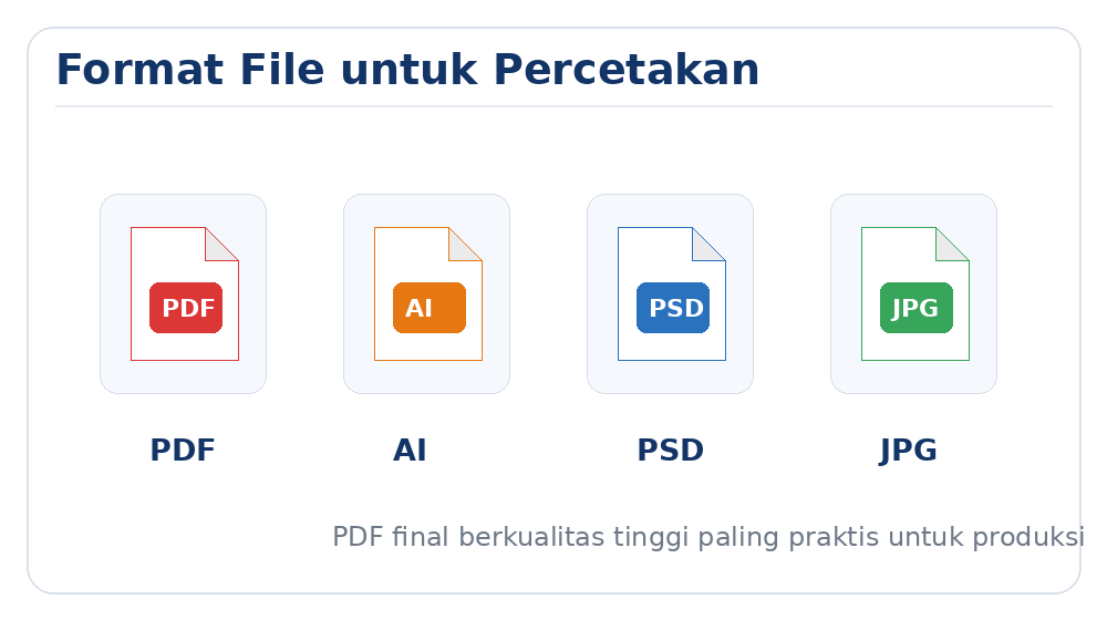
For final delivery: High-quality PDF (PDF/X standard) is the safest and most reliable format for commercial printing.
4. Ensure Correct Artwork Dimensions
Always set up your canvas to the exact physical size of the finished product before designing. Do not rely solely on how large it looks on screen.
Examples:
- Business Card: set to exact specified card dimensions.
- A4: 210 × 297 mm (plus bleed).
- A5: 148 × 210 mm (plus bleed).
- Banner: set to actual banner dimensions or exact scale.
For custom sizes, ensure consistent units of measurement (millimeters, centimeters, or meters).
5. Bleed, Trim Line, and Safe Area
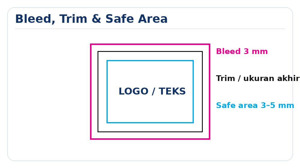
Bleed is the extra artwork area extended beyond the final cut line that gets trimmed off during the finishing process.
Bleed is essential whenever your design features:
- Full-bleed background colors.
- Edge-to-edge photography.
- Patterns or graphics extending to the margin.
Why is Bleed necessary?
Guillotine cutting tools have slight mechanical tolerances during mass production. Without bleed, even a 0.5 mm shift during trimming can result in unwanted white paper borders along the edges.
Recommended Bleed
For standard paper products, a 3 mm bleed on all sides is standard.
Example: Standard A4 dimensions are 210 × 297 mm. Adding 3 mm bleed to all sides yields a document canvas size of 216 × 303 mm.
What is the Trim Line?
The Trim Line indicates the actual final boundary of the printed product after cutting.
What is the Safe Area?
The Safe Area is the inner perimeter where crucial elements should be placed, including: Text, Logos, Phone numbers, Addresses, QR Codes, Barcodes, and essential graphics.
As a rule of thumb, keep vital text and graphics at least 3–5 mm inside the trim line.
Golden Rule:
Extend backgrounds past the trim line into the bleed zone.
Keep important text and logos inside the safe area zone.
6. Font Size & Line Thickness
Text that appears readable on a enlarged screen may be difficult to read once printed on physical media.
Avoid using extremely small font sizes. For body text, 6 pt is generally considered the absolute minimum limit, though optimal legibility depends on font style, weight, contrast, and printing method.
Ultra-light or thin fonts risk losing detail during printing, especially when:
- Font sizes are very small.
- Text colors consist of a multi-channel CMYK mixture.
- Text is placed over complex backgrounds or photos.
- The typeface features ultra-thin hairline strokes.
For fine black body text, use 100% Black (K: 100%) to avoid color misregistration and maintain razor-sharp text edges.
7. Convert Fonts to Outlines / Curves
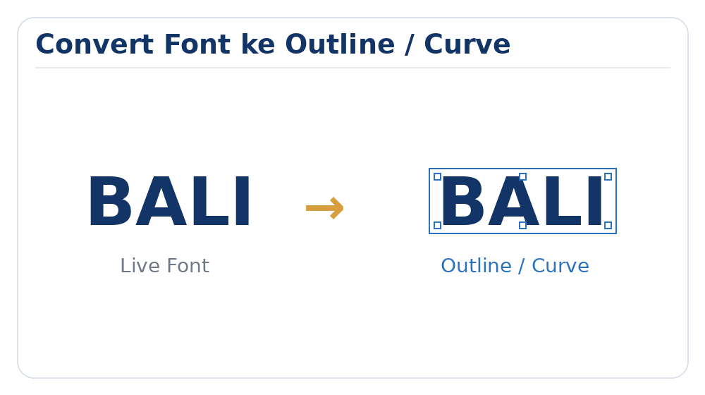
Computers do not all share the same installed font library. If a design file is opened on another system without the required font, software will automatically substitute it with a default font, altering your design layout.
To prevent font substitution errors, convert all editable text in vector files to curves before sending:
- Create Outlines (Ctrl+Shift+O / Cmd+Shift+O) in Adobe Illustrator.
- Convert to Curves (Ctrl+Q) in CorelDRAW.
- Equivalent outline commands in other design applications.
Before outlining: Save an editable master working copy. Once converted to outlines, text can no longer be edited as typed text.
8. Embed or Include Linked Images
Design applications like Adobe Illustrator and Adobe InDesign often link external image files rather than storing them inside the project file.
If you send the main file without embedding or attaching these linked images, the images will appear missing when opened on our production pre-press computers.
To avoid missing link errors:
- Embed all linked graphics directly into the artwork file.
- Use the software’s “Package” feature to gather all assets.
- Or export the final artwork as a high-resolution, self-contained PDF.
9. Transparency, Drop Shadows, Gradients & Effects
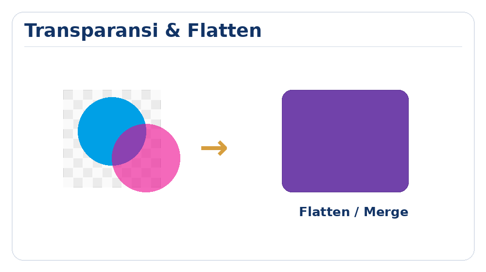
Special visual effects like Opacity, Drop Shadows, Soft Glows, Blending Modes, and overlapping transparent layers look great on screen, but can cause unexpected rasterization glitches during RIP (Raster Image Processor) printing workflows if not handled properly.
Before exporting final print files, inspect all transparent layers and effects. Where appropriate, flatten or rasterize complex transparency layers to ensure accurate output.
Do not rasterize the entire vector layout needlessly, as this would turn sharp text and vector logos into bitmap images.
10. Check Overprint Settings
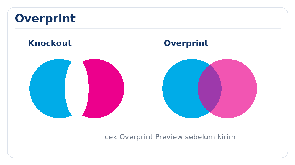
Overprint forces an top color layer to print directly over an underlying background color without creating a blank cutout (knockout) beneath it.
While useful for fine black text registration, unintended overprint settings on white or light-colored elements can cause them to become invisible or unexpectedly blend with background colors during printing.
Common Problem
If a white logo or text element is accidentally set to “Overprint White”, it will disappear entirely on the printed product.
Use the Overprint Preview feature in Adobe Acrobat or Illustrator to inspect your file before final submission.
11. Rich Black vs. Pure Black
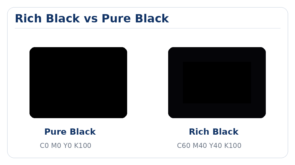
In CMYK printing, there is an important distinction between Pure Black and Rich Black.
Pure Black (K: 100%)
Pure Black values: C: 0% M: 0% Y: 0% K: 100%
Recommended for:
- Small body text & typography.
- Fine black linework and barcodes.
- Small graphics requiring crisp registration.
Rich Black
Rich Black mixes Cyan, Magenta, and Yellow underneath 100% Black to produce a deeper, darker, and more saturated black finish on large surfaces.
Common Rich Black formula: C: 60% M: 40% Y: 40% K: 100%
Recommended for: Large solid black background blocks, heavy headers, and broad graphic shapes.
Do not use Rich Black for body copy or small fonts. Mixing four colors on delicate text can cause color fringing or blurry edges if slight plate misregistration occurs.
12. Preventing Blue Colors from Printing Purple
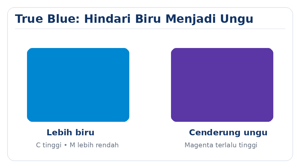
Blue tones in CMYK are created by combining Cyan and Magenta Tints. If the Magenta ratio is set too close to Cyan, the resulting print will shift toward violet or purple.
As a practical rule: To achieve a true blue color, keep the Cyan value at least 25% to 30% higher than the Magenta value (e.g., C: 100%, M: 70%, Y: 0%, K: 0%).
13. Avoid Borders Too Close to the Cut Line
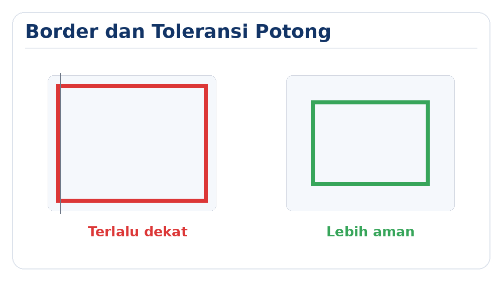
Narrow borders designed close to the outer cut line will highlight minor cutting variances post-production.
Even high-precision cutting equipment has minor mechanical tolerances. If a border line sits too close to the trim line, even a fractional shift will make the border look uneven or off-center on opposite edges.
14. Hairlines & Ultra-Thin Stroke Widths
Extremely thin hairlines may display clearly on high-resolution screens, but may fail to transfer or print cleanly across certain paper stocks, plates, or digital toners.
Avoid using hairline stroke weights under 0.25 pt (or 0.1 mm), especially for diagrams, icons, table rules, and decorative line frames.
15. QR Codes and Barcodes
When incorporating QR Codes or barcodes, ensure adequate physical sizing, sharp contrast (preferably 100% K black on white background), and avoid scaling distortion.
Before submitting: Test-scan your printed proof or screen preview with multiple smartphone camera apps to confirm the link decodes properly.
16. Proofread Text & Data Before Final Approval
Orders are produced based on the exact files approved by the client. Carefully check: Spelling & grammar, Company names, Contact phone numbers, Addresses, Web URLs, and essential details.
17. Guidelines for Books, Booklets & Magazines
Export your multipage files in sequential reading order: Page 1, 2, 3, 4, 5, etc. as a single multi-page PDF document (not reader spreads).
Allow extra inner margin (gutter) allowance near the spine binding area so text doesn’t disappear into fold creases.
18. Banner & Large Format Guidelines
Large format artwork can be designed at reduced proportional scales such as 1:2, 1:5, or 1:10 ratio. Be sure to note the scale clearly in your order instructions or file name.
19. Files Exported from Canva & Online Tools
When exporting artwork from Canva, select the PDF Print download option, choose high resolution, and check the option for Crop Marks & Bleed whenever applicable.
20. Inspect Your Exported PDF
Always open your final exported PDF in Adobe Acrobat Reader or preview software before sending it to the printer to confirm no fonts shifted, images vanished, or layers altered.
Final Print-Ready Checklist
Run through this quick final checklist before sending your files to MahaMeru Bali:
- Dimensions match actual ordered print size.
- Document color mode is set to CMYK.
- Images meet resolution requirements (±300 DPI).
- Background artwork includes minimum 3mm bleed.
- Important text and logos are inside the safe area.
- Fonts are converted to Outlines / Curves.
- Linked graphic assets are embedded or packaged.
- Transparency effects and blending modes reviewed.
- Overprint settings verified.
- Fine black text uses 100% K (Pure Black).
- Border lines are placed safely away from trim edges.
- QR codes & barcodes are test-scanned and working.
- Typos, phone numbers, and addresses proofread.
- Page order is sequential (for booklets/books).
- Final exported PDF verified in PDF reader.
File Naming Guidelines
Use clear, descriptive file naming conventions for your uploads:
CustomerName_ProductType_Dimensions_Qty.pdf
Example: JohnDoe_Brochure_A4_1000pcs.pdf
Important Note on Color & Print Variations
MahaMeru Bali strives to deliver the highest quality print results matching your supplied files. However, please note that physical print colors may exhibit slight variations compared to screen displays due to monitor calibrations, lighting conditions, paper stock absorbency, and ink characteristics.
Not Sure If Your File Is Print-Ready?
If you have any doubts regarding dimensions, resolution, bleed setup, color modes, or file formats, feel free to contact our team. We are happy to inspect your files prior to production.
Proper file preparation ensures sharp, accurate, and stunning print results.
Set up your artwork correctly from the start to avoid costly production delays.
MahaMeru Bali — Printing & Production Service in Bali