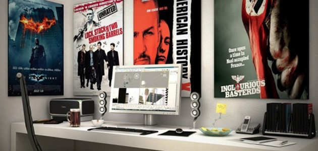
Keep these Design tips in mind when planning your next Large Format Banner Printing Project. When designing and printing a banner, backdrop or outdoor sign, you need a design that stands out. Whether you plan to create the design yourself or Media’s expert designers to create what you want— you should know what qualifies as effective graphic design.
While you see hundreds of designs every day — from billboards on your morning commute to signs on area businesses to posters in your office — do you ever think about the color, balance, picture resolution, font style, line spacing or use of white space that contributed to make the design work?
Banners, media backdrops and outdoor signs are valuable advertising tools that help increase your sales. You want to make sure the design is right in order to create the most effective advertisement possible. Following some basic rules of design ensures that you catch the eyes of all your potential customers.
Fonts Matter
Usually intended to be seen from a distance, large format designs should use fonts that are clean and easy to read, even from very far away.
Generally, sans-serif fonts read better from a distance than serif or script fonts. To test for readability before printing, take several steps away from your computer screen and see if your text is still easy to distinguish.
Experienced graphic designers usually limit the number of fonts they use on each project. Too many fonts often ruins a design — making it confusing and too busy. Instead, try sticking to variants from one or two font families at most.
Your font also conveys a mood. While more difficult to read, a script font feels elegant and formal. Rounded fonts seem friendly, while geometric sans-serifs appear strong and sturdy. Choose a font that suits the mood of your brand. In many cases, simply using a mood-changing font on a single word or short phrase expresses your idea without hurting readability.
Maintain Balance
Balance remains a key element in any design, but especially for large format projects. Too much clutter in a banner, sign or large poster quickly becomes overwhelming. Always try to limit the amount of text and images you include and keep things simple. You really need just a few short sentences or phrases combined with eye-catching graphics.
In addition, maintaining design balance means leaving enough white space or negative space around each element of your design.
Let your design stand out more effectively by not overcrowding the space with too much information. This will keep your design balanced and readable. With a well-balanced design, potential customers can take in key information quickly and easily.
Know the Visual Hierarchy Rules
A good design follows visual hierarchy rules — meaning that the most important information appears first or largest, where the audience expects it to be. Keep in mind that the audience perceives information ranked according to what is on top and largest. Don’t let your business’s message, action step or name get lost in your design.
Remember that we take information in left to right, just as we are taught to read. So, even when dealing with images rather than words, put the the things you want the audience to see first closer to the left.
Check for Contrast
Although you likely need to work with colors that complement your business’s branding, be sure to choose the colors of your design carefully. Contrast is the most important thing to consider. Make sure that any text elements are still visible and readable against the background color. For example, choose a dark font color if you have a light background color.
Limiting your color palette will help keep your design readable as well. Just as with fonts, too many colors will make your design busy and harder to grasp in a few seconds. Unless you’re designing something people will definitely stop to read, keep your color palette limited.
Novice designers may also neglect to work in CMYK rather than RGB. Large format printers work in CMYK, while RGB is intended for viewing on a computer screen and will not print correctly. Remember to make the switch to get the most accurate representation of the colors in your design.
Remember to Include Bleed Area
Leaving a space for bleeds helps ensure that your design will look its best. A bleed means that images that should extend off the page should also extend past the page in the design files so that cutting errors will not show up as a white line or space.
Check with your printer for specific bleed area needs. Typically, 3 to 5 millimeters (1/4 in) is necessary. This way, you won’t lose anything important in your design during the printing process. Otherwise, you will need to print on larger paper and trim off the blank edges.
Use Vector Images
Vector images are helpful at many stages during the design and printing process. Vector images define lines and shapes by mathematical equations. This differs from bitmap formats, such as JPEGs, which are designed for on-screen display.
Vector images stay sharp no matter what size you scale them to, which is helpful in large format projects. They also tend to have smaller file sizes, which saves time for both you and the printer.
Following these design tips will save you time, money and stress on your next banner, sign or large format printing project.
