Color is basically a 3-dimensional formation, so it is called “color space”. To represent 3 dimensional color formation it takes 3 axis, can RGB, CMY, Lab, HLS, etc .. The ability to see the eye has the largest color gamut, then smaller RGB and CMY smaller so that when converting colors to RGB and CMY will look a bit dull (read: display on the monitor). But there are colors that exist in CMY that can not be represented RGB accurately such as 100% yellow color, 100% cyan and 100% magenta. On the contrary there are quite a lot of RGB colors that WILL NEVER show accurately for example purple, green light, etc.
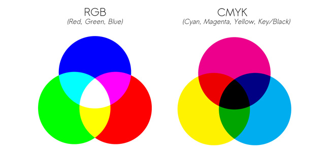
CMYK vs RGB
CMY or CMYK is a color substractive color (substractive color mode) model, its primary colors (Cyan, Magenta, Yellow, BlacK) depend on the pigment of the printed ink & substrate. For the record, printers and prints are simply “output devices”.
RGB is an additive color mode model used for “input devices” such as scanners and output devices such as monitor displays, primary colors (Red, Blue, Green) depending on the technology of tools used such as CCD or PMT on a scanner or digital Camera, CRT or LCD on the monitor display.
Both CMYK and RGB color models are not “independent”, meaning CMYK depends on the print, pigment, substrate & while RGB processes depend on the capacity of the equipment technology used; Meaning that if we have color data R 180, then on 2 different monitors we get different perceptions too, because it is very difficult to simulate 2 different monitors – especially if the technology used is different too.
Because the RGB utilization is usually controlled by the tool manufacturer, it is relatively easy for the research team and the development of the tool factory to improve the tool’s ability to achieve high quality with low tolerance.
As with the CMYK color model, especially for conventional printing, ink is produced by an ink factory and printed by printing using a wide variety of papers. The process of color reproduction is carried out with a variety of parameters, and the results are taken everywhere for evaluation-often under different lighting conditions – metamorphic problems – thereby generating multiple cross-references
UCR vs GCR
Theoretically combining the same red, green and blue colors will produce neutral ash, so red 50%, green 50% and blue 50% can be replaced only by 50% black ink. Photoshop recognizes UCR (Under Color Removal) and GCR (Gray Component Replacement), meaning that UCR is only shadow colors replaced by black ink, while in GCR since the gray color will have been replaced by black ink. Photoshop default is GCR Medium.
UCR and GCR are used by Photoshop as parameters if we want to convert RGB to CMYK. Learn more about using UCR or CGR depending on the print process, so we get the parameters that best fit the printout.
I have a trick to convert 1 image with 2 kinds of conversion process; (1) usually I select black text and convert to CMYK with Black Maximum, then (2) Black result we “merge” to other image conversion result, so text will appear 100% K overprint, not hole. Just keep in mind the GCR calculation does not apply 50% C + 50% M + 50% Y = gray, here Photoshop uses international standard ink parameters (ISO etc.). Therefore, if the ink we use is not standard, then converting RGB to CMYK becomes a busy issue. In other words, there is no one solution that can solve the problem, considering many factors are not measurable or standard.
Tips Konnversi
So simply do not expect RGB colors to be perfectly converted to CMYK. But keep in mind that colors are appearing in context, so in most real problems RGB colors can not be converted properly, but colors look dull due to color impurities.
Logically, CMYK color consisting of more than 2 channels will appear dull. 100% yellow 100% magenta example will appear as a solid red color, but using 100% yellow magenta 100% and cyan 10% will give the impression dull.
So to avoid the color look less good or dull, the way is after convert to CMYK, add saturasi kira2 10-20 with function Image> Adjust> Hue / Saturation (Ctrl / Cmd + U)
There’s nothing wrong with converting RGB to CMYK in Photoshop. The problem is our lack of knowledge of color.
Tips:
- Keep the original color data and do not convert colors if not needed, either Lab -> RBG -> CMYK or vice versa.
- Color conversion is only used at the last moment, if we are going to make a separation movie or CTP.
- Use CMYK data model as input to make Digital Proofing, so please do not make Digital Proofing if we do not know what to do with the picture. Target Profile must be clear, and RGB to CMYK conversion process must be “identical” for digital proofing or CTP separation film, then just do proofing software such as with GMG, EFI, ORIS etc. To convert CMYKtarget to CMYKproof.
“Mapping” Color Management
In Color Management when converting RGB to a standard Photoshop CMYK, it takes into account the gamut of the output device while performing “mapping” colors from RGB to CMYK. The advantage is all RGB colors will be tried “mapping” to CMYK and there is no color that tends to flat because outside the gamut. The drawback is if the original image is not corrected with optimal results will instead tend to dull. Therefore when using color management there are different “rendering intent”, if you convert cartoon images, photos or illustrations. For the record, usually cartoon color is pastel color, preferably in GCR using Black minimum, except the black skets.
Bit Depth
The bit depth metaphor is a LEGO toy. The difference between Lego adults and small children is the lego of small adults. To represent 3 dimensional color space formation from imagine colors we want to create a ball with lego for adults and small children. A ball made with adult lego will result in smoother ball transitions.
Working with a high bit depth will give you a better possible end result. But in most pictures this will not have much effect. High bit depth is necessary for extreme correction conditions or not ideal image conditions.
Raw
Raw comparison is negative film so that color spacenya bigger than TIFF or JPG. TIFF and JPG comparisons are positive slides, meaning “what you see is what you get.” As with RAW, we keep the data completely so that when opened can be selected just as we print negative films can be selected lighter / darker, colored.
MAC atau PC?
All color representations mathematically on PC and Mac are SAME. The main problem is the visual representation, not the original file. So working with Mac and PC CAN PRODUCE THE SAME OUTPUT.
The advantage of using a Mac is a Mac monitor by default is designed to have gamma (read: contrast and dark light) like paper where the white color is not too white and the dark color is not too dense. Moderate PC monitors by default are simulated for electronic conditions such as televisions that contrast much higher. Because the same color will appear on the PC monitor more contrast and darker than it appears on a Mac monitor.
The solution is to perform simple calibration using Adobe Gamma in Control Panel where PC monitor is calibrated using gamma 1.8 instead of 2.2 which is the default of PC monitor.
Forcing a monitor display with printouts is a huge investment, many may not agree with me on this. Excessive confidence in the display of the monitor (Soft proofing) can cause problems because the human resources lack the knowledge & rely on suppliers to calibrate the monitor and keep in mind the rarely color monitor can measure the color temperature automatically, so the use of Gamma does not guarantee the calibration of the monitor works perfectly