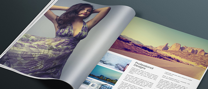
Each magazine page consists of several crucial elements. The image below is your guide and I will explain each of those elements in brief. Since these elements are important, you should have a deeper understanding of how to work with them. In the next articles, I will go through each of them and explain them in detail.
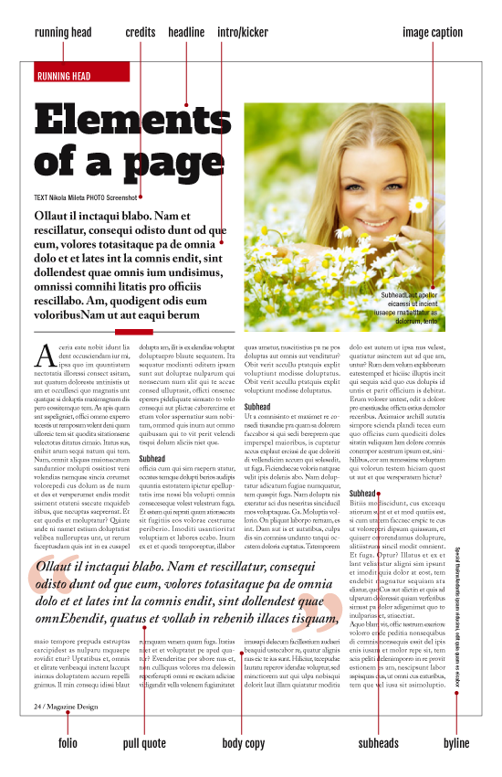
Headlines
First and most important textual element on a page is the headline. The headline is as important as the layout. After the reader opens the page first thing that catches his attention is the layout or some dominant image. The second thing that will draw his attention and lure him into reading the article is the headline. The reader may find layout attractive but if the headline is not appealing and interesting he may skip that article and continue on.
Headlines can vary in size and the importance of the article determines headline size. I will talk about headline treatments in another extensive tutorial. The positioning of the headline is also vital and you should aim to place your headlines on the top of a page.
This is the place where the eye will go first. So many times I have seen headlines placed at the bottom and for me, this is bad design. Not always but it rarely works. Place it at the top and give the headline importance it deserves.
The headline should be set in the bigger size regarding other text elements on the page.
Intro (kicker, stand-first, deck)
As you can see there are many names for this type element. I prefer to call it “intro”, although the most used name is “kicker”. I call it “intro” because this is an introduction to the article. After headline catches the attention of the reader, intro acts as a bridge between headline and body copy. It sets the tone of the article and briefly describes what can you expect from the rest of the article. Intro text should summarize the story and attract reader’s attention.
From the design point of view intro should be set in bigger type size than body copy but in a much smaller size than the headline. You can also make it in different type style. If you set a headline in serif type, you can use sans-serif type for an intro.
You should place intro text just below the headline cause they work as a team. Headline draws reader’s attention, gets him curious and intro text solves his curiosity by giving him more information about the article. That’s why they should work as a team and they should be kept together.
This is not a rule set in stone. Sometimes when you design large article, the headline can stand all by himself on the page, working as a team with the image. This treatment of headline and the main image is also strong and I will explain it in detail in other articles. If you decide to do this kind of design your intro text should stand on top of a body copy, acting as a real introduction to the article.
Body copy (body text)
This is the largest part of any article. Body copy should be as interesting as the design, as the headline and intro text. What’s the point of having great design and headline if the content is not good? No matter how good the design is, if the main body copy is not written in interesting ways, your magazine will lose readers, slowly but certainly.
Designing body copy is the first thing that you should do when you are designing the templates for the magazine. Setting right margins, columns and size of the body copy affect its readability and usability.
The size of your body copy should be consistent throughout entire magazine. Headline size should change according to the importance of the article. Intro size can vary also, but your body copy should stay the same, no matter what.
This is why it is important to experiment with different type sizes that fit different column widths. As I mentioned this is done in the first stages of template creation and you should spend lots of time working on your body copy till you get it right.
You as a designer should use column and type choice to reflect the identity of the brand and to present the story in a way that it suits the content.
Pull quotes
Pull quotes are very useful and attractive design element and I love to play with them a lot. You should work with your copy editor to pull out the most interesting parts of the story and emphasize them. Pull quotes serve as a great tool to break up big blocks of body copy and to give a more interesting look to the article.
You can use them in conjunction with the image so they together can tell a story in their own way.
Pull out quotes can be taken out directly from the body text or they can be summarized excerpts but that will be copy editor’s decision.
Design related, your pull out quotes should be set in a big enough size that it pulls reader’s attention but this size should not be nearly as big as headline’s. You can emphasize the pull quotes with frames, you can put it in a circle, you can place it inside big exaggerated quote signs and so on. You can play with them. Stretch them across few columns to break up the body copy even more.
Subheads
Subheads are used to break up the body copy and to give some clever insight into what the reader can expect in the next few paragraphs. The reader may be putting off if he sees long blocks of text and subheads should be placed to break those blocks and to denote a new section or chapter.
You should set your subhead size just a bit larger than body copy, or you can leave it at the same size as the body copy but emphasize it with some bold font version. Whatever you choose you should distinct them from the body copy.
Few important aspects should be also taken into account. Do not place subheads just below images, do not place them in the last 3 rows at the bottom of the column and do not place them at first 3 rows at the top of the column. Never ever place them at the top of a column. They do not serve any purpose there. Also, do not place them below pull-out quote. Subheads should work as a separate unit and nothing should get in their way.
Image captions
These are parts of the text that should work with the image they relate to. Image and image captions should work as a unit. The copy editor should find some nice copy to be placed on the image or below it. Avoid placing image captions above the images. This is bad design.
Images should be placed on top of the page and their captions should be placed below them or on them. You can set image captions in one or two long rows or you can set them in several narrow rows. Turn off hyphenation for image captions.
The type size should be big as body copy, or around that size. It can even be smaller for a point or two. You can set it in a different style than body copy. Image captions are usually set in sans-serif type for this kind of type has better readability on image backgrounds and at smaller sizes.
As I said rules are there to be broken, but you must have a good reason to do it. Image captions can be set in large type size but then they act like pull out quote.
Bylines and credits
Treatment of these elements is determined by the importance of the authors and photographers that worked on the article. If you are using stock images and you outsource the writing of the article you can place the credits vertically near the gutter.
On the other hand, if the article is written by a famous journalist and images are taken by the photographer you should place bylines just below headline or below the intro text if intro text is located below the headline.
Bylines can be set in the same size as body text or it can be set few points larger. Bylines should be smaller on news pages than on feature pages. Gutter credits can be few points smaller than the body copy.
Running head (section head)
These are navigation elements that guide the reader. If you set them in a brightly colored box and bleed them out of the page they will be visible even when the magazine is closed. Running heads should be carefully designed to reflect the style and tone of the rest of the magazine.
It takes the time to get the right design for them and it should be done in the beginning of the magazine creation. Not all pages need running heads but you can place them at the beginnings of the sections. It would be too much to have them on each page. In this case, repetitiveness would be annoying.
You can have freedom in designing them but do not over do it so that they don’t dominate the page.
Folio
Folio can consist of several elements. The page number is mandatory but others are optional. Others can be publication logo, date, month, section title, web page, but again do not over do it. Few elements are more than enough and you should repeat them all over the magazine. Unlike running heads, folios serve a bigger purpose and should be placed on almost every page. The reader should know in every moment at which page he is or to which page he needs to go.
Folios should be designed conservatively but if your publication is nontraditional one you can play with them. Again you should not play with them on each page, but you can emphasize your folios on certain pages. For example, you can make page number much bigger on section starter pages. In this way, folio will work as another design element or running head, even if they are in separate parts of a page, or you can place a page number on top, just for this page.
The biggest problem with folios is when you have a full-page image that bleeds out of the page. Should you place a folio on that image or not? This is a trick question, but in my experience, I can tell you to put folio, page number at least, on each page if it is clearly visible.
If you decide not to use the folio on full bleed image pages you can get into a problem. Let’s say you have a 20-page story with 12 pages of images. For example like in National Geographic. If you do not place folios on those pages you can irritate the reader and can cause production problems.
If you choose to put folio on only one page on a spread, put it on the right page since it is the more visible page. I like to put them on all pages if the folio is going to be clearly visible. If it is not going to be clearly visible, then what’s the point of placing it in the first place.
Panels and box copy
Boxes are used as news items or as extensions to a long article in which you can place some other facts or data which are relevant to the article. These types of copy are generally shorter in length and have more factual tone. They can be in a form of a text, bulleted text or lists.
From the design point of view, boxed text should be set in a different style than main body copy. Usually in sans-serif type, since the box copy is not long and sans-serif type should be avoided for long dense text stories. Size should be around the same as main body copy. These boxes can have their own headlines and kickers. The headline should be few to several points larger than box copy and kicker should be set in the same size as box copy or few points bigger. You can use heavier type for headlines and kickers to emphasize them more.